“ If one says “reds”— the name of a color — and there are fifty people listening , it can be expected that there will be fifty reds in their minds. And one can be sure that all these reds will be very different. “— Josef Albers
Color Temperature mainly refers to the feeling one gets when viewing a color or a set of colors. Generally, yellows, oranges, and reds are considered warm, whereas greens, blues, and purples are considered cool. When used within a work of art, warm colors seem to advance toward the viewer, and cool colors appear to recede into the distance. This dynamics is important to remember when suggesting depth or creating an area of focus.
 |
“Lily—The Goddess of the Garden” I created this artwork using my Water-soluble colored pencils from Faber-Castell and Faber-Castell Polychromos Colored Pencils on watercolor paper. |
In my above artwork the yellows, oranges and reds ( warm colors) are in the foreground of the viewer while the purples, blues ( cool colors ) are in the background thus adding depth to this artwork.
*** Disclaimer ***: For all of my Commission art pieces and Exhibition art pieces, I only use high quality Artist grade Color pencils only such as my Faber- Castell Polychromos Colored Pencils and Derwent Lightfast Color Pencils and Faber-Castell Albrecht Durer watercolor pencils Only. I use only these pencils because these pencils have good lightfast ratings. ( Lightfastness is the ability of a medium to resist qualitative changes from light. It is the ability of a picture to not fade over time. UV radiation from sunlight (and sometimes electric light) break down the molecules in the medium, causing bleaching and discoloring.)
But if Colored Pencils are a new medium for you, or if you are looking to just explore and see if Colored pencils will be a good fit for you, then I would recommend to start out with a small set of the Prismacolor Premier® Soft Core Colored Pencils mainly because this brand is widely available.
Please note: For all of my examples/swatches in the rest of this post, I have used the Prismacolor Premier® Soft Core Colored Pencils only.
 |
As shown in the above color wheel, when you divide the color wheel in half by drawing a line from a point between red and red-violet to a point between yellow-green and green. This makes a visual distinction between the warm and cool colors.
Some examples of Warm and Cool Colors in the Prismacolor Premier® Soft Core Colored Pencils include:
 |
 |
This photo shows swatches and examples of some of the Cool Colors in the Prismacolor Premier Colored Pencil line. |
Relative Temperature :
Within individual colors exist warm and cool varieties. If a color leans toward red on the color wheel, it is considered warmer than a version of the color that leans blue.Relative to each other, sunburst yellow (PC 917) leans towards red and lemon yellow (PC 915) leans towards blue; therefore, sunburst yellow ( left) is warmer than lemon yellow ( right) as shown in the picture below:
Color Relativity:
While colors are generally classified as warm or cool, they can also be relatively warm or cool within their hue. Although red is considered the warmest color, there are cool reds and warm reds. A cool red contains more blue (such as magenta), and a warm red contains more yellow (such as coral). The way we perceive a color’s characteristics is relative to its surroundings. By using contrasts in temperature, value, and chroma, we can make colors appear warmer or cooler, lighter or darker, and brighter or duller simply with the colors we place next to them.
Relative temperature A color’s temperature is influenced by surrounding colors. Note how the hot pink circle appears cooler set against orange (A) than Ultramarine (B) in the picture below:
 |
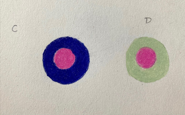
Relative Value: Our perception of a color’s value depends on its surrounding color. Notice how the same hot pink circle appears lighter in example (C) than in example (D) as shown in the picture below :
 Colors used here are Hot Pink (PC 993), Violet Blue (PC 933) and Pale Sage (PC 1089). Colors used here are Hot Pink (PC 993), Violet Blue (PC 933) and Pale Sage (PC 1089). |
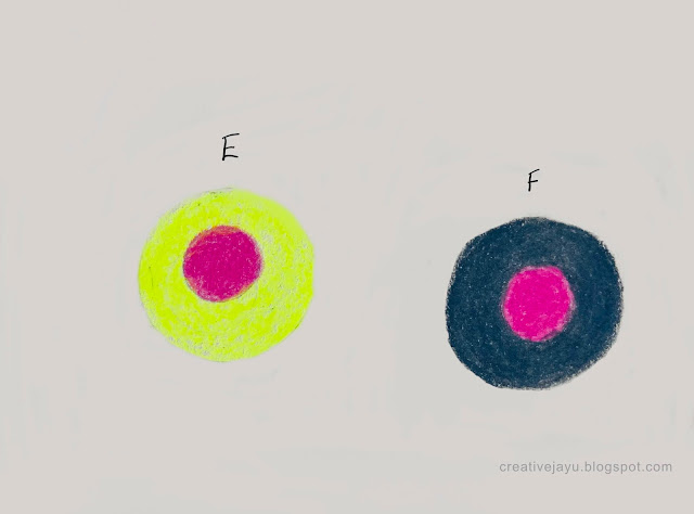
Relative Chroma: A color’s chroma can appear different depending on nearby colors. Notice how the same hot pink circle appears dull against the neon yellow (E) and bright against grey (F) as shown in the picture below:
 |
Colors used here are Hot Pink (PC 993), Neon Yellow (PC 1035) and 70% Cool Grey ( PC 1065). |
So to summarize :
- If you want to make a color appear warmer place a cooler color adjacent to it.
- If you want to make a color lighter place a darker color adjacent to it.
- And finally , if you want to make a color appear brighter , place a duller color adjacent to it.


