Showing posts with label Art Techniques. Show all posts

Thursday, June 3, 2021

Understanding Color Temperature

 “ If  one says “reds”— the name of a color — and there are fifty people listening , it can be expected  that there will be fifty reds in their minds. And one can be sure that all these reds will be very different. “— Josef Albers


Color Temperature  mainly refers to the feeling  one gets when viewing a color or a set of colors. Generally, yellows, oranges, and reds are considered warm, whereas greens, blues, and purples are considered cool. When used within a work of art, warm colors seem to advance toward the viewer, and cool colors appear to recede into the distance. This dynamics is important to remember when suggesting depth or creating an area of focus.


Lily-- The Goddess of the Garden

“Lily—The Goddess of the Garden” I created this  artwork  using my  Water-soluble colored pencils from Faber-Castell and Faber-Castell Polychromos Colored Pencils on watercolor paper.

In my above  artwork the yellows, oranges  and reds ( warm colors) are in the foreground of the viewer while the purples, blues ( cool colors ) are in the background  thus adding depth to this artwork. 


*** Disclaimer ***: For all of  my Commission art pieces and Exhibition art pieces, I only use high quality Artist grade Color pencils only such as my Faber- Castell Polychromos Colored Pencils and Derwent Lightfast Color Pencils and Faber-Castell  Albrecht Durer watercolor pencils Only. I use only these pencils because these pencils have good lightfast ratings. ( Lightfastness is the ability of a medium to resist qualitative changes from light. It is the ability of a picture to not fade over time. UV radiation from sunlight (and sometimes electric light) break down the molecules in the medium, causing bleaching and discoloring.)

But if Colored Pencils are a new medium for you, or if you are looking to just explore and see if Colored pencils will be a good fit for you, then I would recommend to start out with a small set of the Prismacolor Premier® Soft Core Colored Pencils mainly because this brand is widely available. 


Please note: For all of my examples/swatches  in the rest of this post, I have used   the Prismacolor Premier® Soft Core Colored Pencils only.


Color Wheel

Color Wheel Created using Prismacolor Premier Color Pencils. Colors used to create this wheel are Permanent Red (PC 122), Canary Yellow (PC 916) and  China Blue (PC 1100)


As shown in the above color wheel, when you divide the color wheel  in half by drawing a line from a point between red and red-violet to a point between yellow-green and green. This makes a visual distinction between the warm and cool colors.


Some examples  of Warm and Cool Colors  in the Prismacolor Premier® Soft Core Colored Pencils include:


Examples of Warm Prismacolor Color Pencils

The above photo shows  swatches and examples of some of the  Warm Colors  in the Prismacolor Premier Colored Pencil line.


Examples of Cool Colors in Prismacolor Color Pencils

This photo shows  swatches and examples of some of the  Cool Colors  in the Prismacolor Premier Colored Pencil line.


Relative Temperature :


Within individual colors exist warm and cool varieties. If a color leans toward red on the color wheel, it is considered warmer than a version of the color that leans blue.Relative to each other, sunburst yellow (PC  917) leans towards  red and lemon yellow (PC  915)  leans towards blue; therefore, sunburst yellow ( left) is warmer than lemon yellow ( right)  as shown in the picture below:


Relative Temperature in Colors
Color swatches used to show relative temperature  that exits  within the individual colors. 


Color Relativity:


While colors are generally classified as warm or cool, they can also be relatively warm or cool within their hue. Although red is considered the warmest color, there are cool reds and warm reds. A cool red contains more blue (such as magenta), and a warm red contains more yellow (such as coral). The way we perceive a color’s characteristics is relative to its surroundings. By using contrasts in temperature, value, and chroma, we can make colors appear warmer or cooler, lighter or darker, and brighter or duller simply with  the colors we place next to them.


 Relative temperature  A color’s temperature is influenced by surrounding colors. Note how the hot  pink  circle appears cooler set against orange   (A) than Ultramarine  (B) in the picture  below:


Relative Temperature

         Colors used here are Hot Pink (PC 993), Orange (PC 918) and Ultramarine  (PC 902).


Relative Value:  Our perception of a color’s value depends on its surrounding color. Notice how the same  hot pink circle appears lighter in example (C) than in example (D) as shown  in the picture  below :


Relative Value                  Colors used here are Hot Pink (PC 993), Violet Blue (PC 933) and Pale Sage (PC 1089). 


Relative Chroma:  A color’s chroma can appear different depending on nearby colors. Notice  how the same hot  pink circle appears dull against  the neon yellow (E) and bright against grey (F)  as shown in the picture  below:


Relative Chroma
Colors used here are Hot Pink (PC 993), Neon Yellow (PC 1035) and 70% Cool Grey ( PC 1065).


So to summarize :


  1. If you want to make a color appear warmer place a cooler color adjacent  to it.
  2. If you want to make a color lighter place a darker color adjacent to it.
  3. And finally , if you want to make a color appear brighter , place a duller color adjacent to it.




Friday, January 22, 2021

Quick Tip: How to paint with a toothbrush?

 To ring in the New Year , I thought  I will share with you a fascinating technique on how to use a toothbrush to try an interesting technique with watercolors. This is also a fun project  to do with kids or the kid in you!

Painting with a Toothbrush
Painting with a Toothbrush 


Toothbrushes work really well with liquid watercolors.Their bristles are stiffer than those of normal watercolor brushes and this creates a different kind of line.


Rooster
Colorful Rooster


How to paint a rooster using a toothbrush


This is an example of a really dynamic effect created by a toothbrush as a finishing touch to an illustration.


Step 1:  Paint the rooster using watercolor as I have done here, leaving a space for the tail feathers.


Rooster
Colorful Rooster

Step 2:  Dip the toothbrush in the liquid watercolor and use it to paint a spiky tail. Use two or three colors so that they mix together slightly.


Rooster
Colorful Rooster


Step 3:  Add some rough strokes with the toothbrush under the rooster to give the vague impression of a horizontal surface to ground the image.


And that's  it, you now have a colorful  rooster that is ready to take on the world!


I hope you enjoyed  this mini tutorial and if you tried this technique   share with me in the comments  below or tag me on Instagram — @creativejayu I would  love to see what you create. 


Color is the place where our brain and the universe meet." -- Paul Klee


Wednesday, September 2, 2020

Legally Free Reference Photo Websites for Artists or Designers

 Artists and sometimes even experienced professionals such as Designers  will use photos that they find in the Internet to use for their next painting or drawing or designs. If you do this, very often you'll be breaking copyright law and infringing on someone else's intellectual property. 

You need to use photos that have a special license attached to them. The special licenses we want to look for are: 

1) Creative Commons Zero License (CC0) 

2) Attribution Licence 

With both of these licenses, you can make any kind of artwork you like from the photo without asking permission. You can sell your artwork or make prints of your artwork and sell those, or otherwise use your artwork in any commercial design.  The only difference is that the CC0 License doesn't require  your credit to  the owner of the photograph whereas  the Attribution License does.

Some of the sites I've listed below contain mostly CC0 images.The sites below are listed in the order of my own personal preference. 

Ready? Let's find you some inspiring free photos that you can use for your next masterpiece!


1) Pixabay     https://pixabay.com 


https://pixabay.com


This is my personal favorite website. I use this website  for a vast majority of my references. 

Pixabay is a vibrant community of creatives, sharing copyright free images and videos. All of the content in this website  are under  Creative Commons Zero License (CC0). A CC0 license means you are free to use any image on the site, even if you want to go on to sell your artwork in any commercial form. The site is very easy to browse and you can quickly check for the CC0 license next to the image.


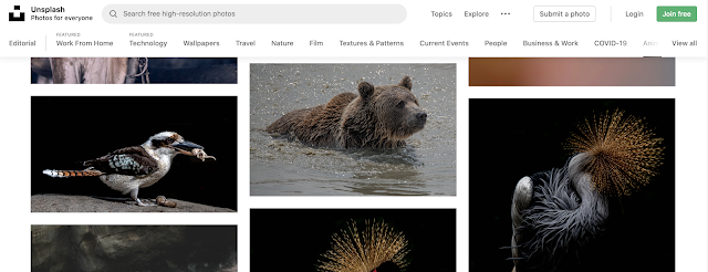
2) Unsplash   https://unsplash.com


https://unsplash.com


If you are looking for stunning photographs from professional photographers then this is the place for you.  All the Images are under a CC0 license so you can browse with more confidence. The only downside is the Category page is bit limited and it is hard to spot at the first glance. Having said that their search tool is great and this site is best used for  inspiration rather than looking out  for  a very specific subject. 

3) Pexels    https://www.pexels.com


https://www.pexels.com


This site offers a huge collection of high-quality free stock photos from other sites around the web. Very easy to browse lots of images quickly and all are mostly published in the CC0 license. In this site the images are nicely laid out for fast browsing. The only downside is that they don't have a huge collection as Pixabay. 

4) Public Domain Pictures    https://www.publicdomainpictures.net/en/


https://www.publicdomainpictures.net/en/

This site offers over 324,878 photographs published under  Creative Commons Zero, with many of a very high quality. Each image has a Premium and Free download option. The Premium option allows you to download a higher resolution version but the free option is good enough for most  artists purposes. 

5) Wikimedia Commons https://commons.wikimedia.org/wiki/Main_Page


https://commons.wikimedia.org/wiki/Main_Page

Wikimedia is a part of the Wikipedia family. It contains over 30million digital files that editors of Wikipedia can use, or that can be downloaded by anyone for  other uses. But you need to be careful even though it is on Wikimedia.  It offers the largest collection of free images online. If you are looking for something specific then you will probably find it here. Many images ( but not all) are published under the CC0 license or declared as public domain. Make sure you check.  Some disadvantages  using this site is you have to rely on their search box and you cannot browse by category. Not all images are in the public domain. Make sure to check the license under each image. 

 Please Note: In this list, I have not used  Wikimedia Commons that much mainly because of all these disadvantages that I have listed above. 

Let me know in the comments below if you found this useful and if you know of any other websites that I can add to my list. Thank you for reading!


Saturday, March 14, 2020

My Favorite Inspirational Art Quotes by the Masters

 With the Covid-19 pandemic that is happening globally, I decided to put together some of my favorite inspirational art quotes by the Masters  which will aid in  feeding the soul of the artist and  help in rekindling the artists creative spirit during these difficult times.

Here are some of my favorite Art Quotes by the Masters: 

 “Color is my day-long obsession, joy and torment.” – Claude Monet

“If I create from the heart, nearly everything works; if from the head, almost nothing.” – Marc Chagall

“I never paint dreams or nightmares. I paint my own reality.” – Frida Kahlo

“When the color achieves richness, the form attains its fullness also.” Paul Cezanne


Pablo Picasso Artist Quote

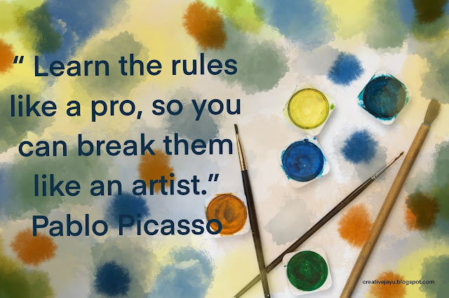
“Learn the rules like a pro, so you can break them like an artist.” – Pablo Picasso

“Have no fear of perfection, you’ll never reach it.” – Salvador Dali

“I am seeking. I am striving. I am in it with all my heart.” – Vincent Van Gogh

“Color! What a deep and mysterious language, the language of dreams.” Paul Gauguin

“In nature, light creates the color. In the picture, color creates the light.” Hans Hofmann

Creativity takes courage.” Henri Matisse

The object of art is not to reproduce reality, but to create a reality of the same intensity.”  Alberto Giacometti 

Art is not what you see, but what you make others see.” Edgar Degas 


Georgia O'Keeffe Artist Quote


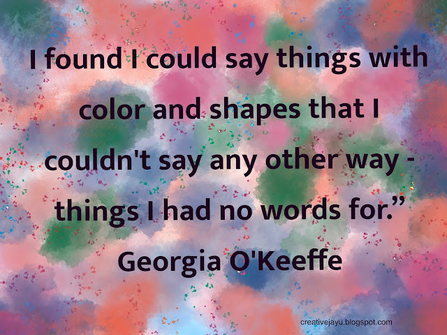
“I found I could say things with color and shapes that I couldn't say any other way - things I had no words for.” Georgia O'Keeffe

Don’t think about making art, just get it done.  Let everyone else decide if it’s good or bad, whether they love it or hate it.  While they are deciding, make even more art.” Andy Warhol 


“Color is the keyboard, the eyes are the harmonies, the soul is the piano with many strings. The artist is the hand that plays, touching one key or another, to cause vibrations in the soul.” Wassily Kandinsky

Nature is not only all that is visible to the eye.. it also includes the inner pictures of the soul.”  Edvard Munch

There's no retirement for an artist, it's your way of living so there's no end to it.” Henry Moore 

One can have no smaller or greater mastery than mastery of oneself.” Leonardo da Vinci 

Creativity is allowing yourself to make mistakes. Art is knowing which ones to keep.” Scott Adams 

If a man devotes himself to art, much evil is avoided that happens otherwise if one is idle.”  Albrecht Durer 

Every artist dips his brush in his own soul, and paints his own nature into his pictures.” Henry Ward Beecher

“The works must be conceived with fire in the soul but executed with clinical coolness.” – Joan Miró

“Every artist was first an amateur.” – Ralph Waldo Emerson

Ansel Adams Art Quote


“You don’t take a photograph, you make it.” – Ansel Adams

“We don’t make mistakes, just happy little accidents.” – Bob Ross

"Without atmosphere a painting is nothing."-- Rembrandt 

I hope you enjoyed this list of famous artist quotes. And I hope that this post has inspired you to pick up your pencils or brush to create your own masterpieces. 

If you have a favorite inspirational art quote, then I would love to know which is your favorite art quote in the comments below. Thanks!

Saturday, February 29, 2020

How The Impressionists Used Complementary Colors To Create an Impact on their artworks

 Complementary colors are basically colors which are on directly opposite sides of the color wheel. So blue is a complement of orange, red is a complement of green, yellow is a complement of purple and so on.


Complementary Color Wheel


Complementary colors provide striking visual effects when paired together. Claude Monet said this about complementary colors in 1888:

"Color makes its impact from contrasts rather than from its inherent qualities....the primary colors seem more brilliant when they are in contrast with their complementary colors."--  Claude Monet

What he meant was that red for example has no meaning or power by itself. But, when paired with a complementary color (being green), you are able to properly see the richness and warmth of that red.

Color is all relative.

The impressionists were masters of color and were very clever in how they used complementary colors to create stunning visual effects. Let us now go through some of the paintings by Claude Monet and Vincent van Gogh which utilizes  complementary colors.

In the painting below of Van Gogh's bedroom, we see a  very intense red of the bedsheet which contrasts against the dull green of the floor. We  also see that the intense orange of the bed frame  contrasts against the weaker blue in  the walls and doors.

Vincent van Gogh, Vincent's Bedroom In Arles, 1889

In the flower painting below, the vibrant red on the wall contrasts against the dull greens of the table and leaves.

Vincent van Gogh, Still Life With Roses And Sunflowers, 1886

In this portrait of Van Gogh he used a simple combination of blues and oranges to create a very striking contrast. His face almost jumps out of the canvas at the viewer. 

Vincent van Gogh, Self Portrait, 1889

In this landscape van Gogh contrasted the vibrant oranges in the foreground against the rich blues in the sky.

Vincent van Gogh, Mulberry Tree, 1889

In this painting by Claude Monet you have a striking contrast between the dull blues and the rich oranges in the sky.

Claude Monet, Grainstacks At Sunset, Snow Effect, 1890-1891

In this painting below  the vibrant reds and yellows contrast against the dark greens and violets.

Claude Monet, Etretat, Cliff Of d'Aval, Sunset, 1885

Finally, in this classic painting by Claude Monet, the sun is contrasted against the dull blue-grays. The orange of the sun is actually not that intense. But, when the rest of the painting is a dull blue-gray, it looks very intense.

Claude Monet, Impression, Sunrise, 1872


I hope you enjoyed reading this article on how Complementary colors used by the Great Masters can add drama to a painting. I hope that this has been inspirational and educational to you. Thank you for reading.

Photo References for Van Gogh and Claude Monet paintings taken from -https://www.wikiart.org

I am sure that there are other great artists who create an impact with their art by using a complementary color scheme. Let me know in the comments below which  other artists you think creates an impact by using a complementary color scheme. I would love to hear from you! Thanks!


Monday, January 20, 2020

Basics-- Composition

 Composition involves working with spatial concepts to create a pleasing layout. Some rules are classically simple. The first thing you need to decide is if you want to use a vertical (portrait) or a horizontal (landscape) format. Sometimes that decision can be simple but not always.  Consider the fact that horizontal compositions tend to be restful, and vertical compositions are more energizing. So if you are making a sketch of cattle lying in a field in a vertical format you might want to reconsider your decision. Also where you place your center of interest will determine its importance. Experiment with different arrangements and formats until you are pleased with the visual weight of your center of interest. 

CENTER OF INTEREST: The center of interest is the most important visual element of a picture. In most realistic works of art, the center of interest is the subject of the painting. 

Divide the Composition into Thirds

Divide your working area into thirds, top to bottom and from side to side as shown in the picture below. The center of interest will be most pleasing, in a traditional manner, if you place it at one of the intersections of those lines. This works well, whether you choose a horizontal or a vertical format. 

Rule of Thirds

Infographic  below shows eye-tracking  studies  to show  where will the viewer look first  when looking at a picture/painting/photographs. This  will aid in designing your own compositions in the future. 


Eye- Tracking Focal point Studies

Off Balance

It is not always necessary or even desirable to stick with the classical mode of composition, of course. Explore an off-balance, unusual composition by placing your subject off to one side for a lively sense of motion--  like  the picture below.

Off Balanced Composition


 *** Quick Tip ***

USE VARIETY-- Don't make everything the same size or spaced the same distance apart in your composition. That can be boring and static. By using variety in sizes or spacing can add visual interest to the composition. 

 So, do you have a Composition tip or hack that you would like to share? Let me know in the comments below.