Friday, October 2, 2020

How Do You Make Art When You Are Experiencing an Artist Block?

 I think that every artist goes through some flat periods where they lack some creative inspiration. You end up staring at your canvas on the easel  for hours  wondering  what to paint on it. You barely paint a stroke on your canvas. Sometimes these things turn into days or weeks or years. This is known as the dreaded artist block. 


Here are my top  five tips for you that have worked for me and helped me  overcome the dreaded artist block


 1) Join an Art Club 


Being a part of an Art Club  can definitely inspire an artist to pick up the brush and paint. You get to be a part of a vibrant art community  and see artworks of other artists. By talking to other artists as to how they created their artworks and learning their art techniques can get your creative juices flowing. I feel very fortunate to be a member of the Sunnyvale Art Club for  about 11 years at the time of writing  this post. And every time we  have  a meeting , it motivates me to go and pick up my brushes. 


Sunnyvale Art Club  https://www.sunnyvaleartclub.org


https://www.sunnyvaleartclub.org


Quick Tip: If you don't  have access to an art club in your area, then Youtube is your next best friend. 


2) Take a Break from your studio and go for a Walk


 The  best way that I found out to get over the dreaded artist block is to take a break from my studio and go for a walk at my local park. I would also take   a pencil and my journal and my camera.  I would then go and do some field sketching of the wildlife  like observing wildlife behavior of the animal/bird and then draw and record it on my nature journal while I am at the park. I would also do sketches of  flowers , stones or anything that I find interesting and draw them onto my nature journal. I would also use this opportunity to snap some  pictures which I can use as reference photos for my future artworks. 


Field sketching helps me overcome my artist block  by igniting new ideas for future paintings thus cultivating a richer experience of being creative. 


Mallard Duck


 3) Read an instructional Art book


Reading an instructional art book has helped me fire up my creative juices. Here is a good book that I recommend reading :


Daily Painting: Paint Small and Often To Become a More Creative, Productive, and Successful Artist by Carol Marine. 
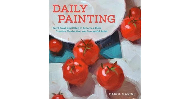

Daily Painting Book


I think it is a great book for someone who wants to pursue painting but are short on time. Daily Painting focuses on painting in regular intervals and creating many small paintings using an alla prima technique.   This book has many how- to lessons , by following along I find that I am learning new art techniques found in this book  which in turn helps me keep my creativity alive. 


4)  Visit an Art Museum 


Visiting an art museum for me definitely cures my artist block. Looking at artworks by  the great masters inspires me to pick up my painting brush and paint on my canvas. 
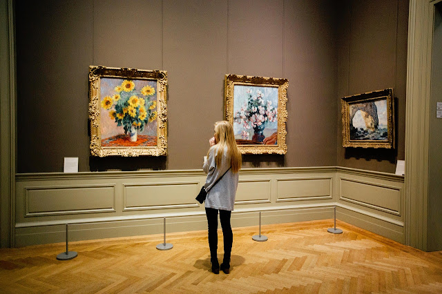

Art Museum


If you are not able to visit an art museum, then you can peruse some of the master paintings online at Museum of Modern Art ( MoMA, New York) . This website has tons of information of modern and contemporary  artists.   I like  looking  into the artist artworks, reading  about them and try to understand what elements worked so well for them and make them work for me.  Another favorite  website of mine is the Google Arts and Culture website. This website features content from over 1200 leading museums. There are tons of articles to get you motivated. 


Website links:


MoMA, New York--- https://www.moma.org/collection/


Google Arts and Culture--  https://www.google.com/culturalinstitute/beta/


5) Cleaning up your Art studio/ art space


Sometimes cleaning up your art studio/ space and removing clutter in your art space can do the trick. I would move things around my art space/ studio and maybe  re-decorate my space with some  of my favorite things in my case it is figurines/ toys of reptiles in  my art space to get into the mood of creating art. 


Picture of my small art space where I create my masterpieces!


I hope these tips help you to get past the dreaded artist block and help you pick up your brush and create your own masterpiece. Let me know in the comments below how do you get rid of the dreaded artist block or if you have found this article useful  or which one is your favorite way to overcome an artist block


Wednesday, September 2, 2020

Legally Free Reference Photo Websites for Artists or Designers

 Artists and sometimes even experienced professionals such as Designers  will use photos that they find in the Internet to use for their next painting or drawing or designs. If you do this, very often you'll be breaking copyright law and infringing on someone else's intellectual property. 

You need to use photos that have a special license attached to them. The special licenses we want to look for are: 

1) Creative Commons Zero License (CC0) 

2) Attribution Licence 

With both of these licenses, you can make any kind of artwork you like from the photo without asking permission. You can sell your artwork or make prints of your artwork and sell those, or otherwise use your artwork in any commercial design.  The only difference is that the CC0 License doesn't require  your credit to  the owner of the photograph whereas  the Attribution License does.

Some of the sites I've listed below contain mostly CC0 images.The sites below are listed in the order of my own personal preference. 

Ready? Let's find you some inspiring free photos that you can use for your next masterpiece!


1) Pixabay     https://pixabay.com 


https://pixabay.com


This is my personal favorite website. I use this website  for a vast majority of my references. 

Pixabay is a vibrant community of creatives, sharing copyright free images and videos. All of the content in this website  are under  Creative Commons Zero License (CC0). A CC0 license means you are free to use any image on the site, even if you want to go on to sell your artwork in any commercial form. The site is very easy to browse and you can quickly check for the CC0 license next to the image.


2) Unsplash   https://unsplash.com


https://unsplash.com


If you are looking for stunning photographs from professional photographers then this is the place for you.  All the Images are under a CC0 license so you can browse with more confidence. The only downside is the Category page is bit limited and it is hard to spot at the first glance. Having said that their search tool is great and this site is best used for  inspiration rather than looking out  for  a very specific subject. 

3) Pexels    https://www.pexels.com


https://www.pexels.com


This site offers a huge collection of high-quality free stock photos from other sites around the web. Very easy to browse lots of images quickly and all are mostly published in the CC0 license. In this site the images are nicely laid out for fast browsing. The only downside is that they don't have a huge collection as Pixabay. 

4) Public Domain Pictures    https://www.publicdomainpictures.net/en/


https://www.publicdomainpictures.net/en/

This site offers over 324,878 photographs published under  Creative Commons Zero, with many of a very high quality. Each image has a Premium and Free download option. The Premium option allows you to download a higher resolution version but the free option is good enough for most  artists purposes. 

5) Wikimedia Commons https://commons.wikimedia.org/wiki/Main_Page


https://commons.wikimedia.org/wiki/Main_Page

Wikimedia is a part of the Wikipedia family. It contains over 30million digital files that editors of Wikipedia can use, or that can be downloaded by anyone for  other uses. But you need to be careful even though it is on Wikimedia.  It offers the largest collection of free images online. If you are looking for something specific then you will probably find it here. Many images ( but not all) are published under the CC0 license or declared as public domain. Make sure you check.  Some disadvantages  using this site is you have to rely on their search box and you cannot browse by category. Not all images are in the public domain. Make sure to check the license under each image. 

 Please Note: In this list, I have not used  Wikimedia Commons that much mainly because of all these disadvantages that I have listed above. 

Let me know in the comments below if you found this useful and if you know of any other websites that I can add to my list. Thank you for reading!


Thursday, August 20, 2020

Creative Art Challenges for Inspiration

 With the Covid-19 pandemic that is happening worldwide, sometimes it is hard to get to the easel and start a painting. With social distancing in effect these days, we don't get to meet our artsy friends like before for inspiration . So I decided to put together some of my favorite online  artists resources offering art challenges which helps artists to stay inspired and get creating art during these difficult times. And the best part of all these challenges is that you can use what you have whether it is colored pencils, or  watercolors or markers or something as simple as a ballpoint pen to get you started. 

  Here are my top four  favorite artist  resources:  

1) Doodlewash-- https://doodlewash.com

 It is a watercolor painting & sketching social community for artists of all skill levels, with over 500 stories from featured artists all over the world! This art community was started by Charlie O’Shields from Kansas City in 2015. The Art Challenges in this group are fun to do and it is my most favorite part of this group.  I also  enjoy reading about the featured  guest artists and  the various blog posts in this art community. 

https://doodlewash.com


2) Inktober-- https://inktober.com

Inktober is a month long Art challenge where artists create an ink drawing each day during October; creating thirty-one drawings in thirty-one days. Jake Parker started the challenge back in 2009 as a way to improve his own inking skills. Since then the challenge has grown into a massive event with people participating all over the world. Starting this year  artists can also participate in their new art challenge  called "One Drawing A Week  All Year Long Art Challenge"( Inktober52). Back in 2015 I participated in their Inktober Classic Art Challenge  and back then I did not have ink art supplies. I used my colored pencils,  ballpoint pens and my moleskin journal for all of these challenges.   I had a blast of a time and totally enjoyed  working on these challenges  and the best part was we get to share it on Instagram  with other artists from all over the world!


https://inktober.com


3) They Draw and Cook-- https://www.theydrawandcook.com


They Draw & Cook (TDAC) was founded in 2010 and is the internet's largest collection of illustrated recipes created by artists from around the world.The founders of this site are Nate Padavick and Salli S. Swindell are a brother/sister design and illustration team known as Studio SSS. They have created hundreds of magazine and book illustrations, thousands of greeting card designs, and, of course, many super tasty illustrated recipes! They Draw & Cook (TDAC) is a big happy creative community  where creative people share their love of food and art through illustration. In order to participate in their Handpicked Design Challenges, artists need to sign up to their free and beautifully illustrated newsletter to get access to their Creative Art Prompts. I would love to participate in their future Design Art Challenges.


https://www.theydrawandcook.com


4) Doodle Addicts -- https://www.doodleaddicts.com


Doodle Addicts is an art community and platform dedicated to celebrating the incessant need to draw, sketch, and doodle with anything and everything we can get our hands on. Whether it be in a sketchbook, on a napkin, with your stylus and tablet, or on a giant wall, artists of all types are welcome here. It is their growing community for like-minded creatives to share and inspire one another through their portfolio of artwork, quirky drawing challenges and insightful interaction. This community offers tons of drawing challenges and art prompts  that is guaranteed to get out of your comfort zone while helping you sharpen your artistic skills. To get notified to their next drawing challenges all you need to do is sign up for free  with your name and email in the website's "Drawing Challenges " webpage. 


https://www.doodleaddicts.com


So here is my list of favorite artist resources to help you stay inspired. Do you have a favorite artist community that you would like to share? If yes,  I would love to hear from you which is your favorite artist community in the comments below.  


Thank you!

Friday, June 26, 2020

What Colors to Use to Describe the Changing Seasons for your Artworks?

Ever wondered what color to use for your paintings for that particular season? Fret not! Here are some of my seasonal palette suggestions to help you get started.

Each season is associated with different weathers and therefore  with different color themes. We think of winter, for example , in terms of cold and muted colors. Spring, by contrast, bursts forth in bright greens and yellows. So naturally you will need an appropriate color  palette  to describe each season.

Summertime: Summer colors are warm as the season itself. Relax in the heat as fiery reds, hot pinks, and burning oranges echo the sunshine, and greens become dark and intense.
Use lemon yellow,cadmium yellow,yellow ocher, raw umber, Indian red,cadmium orange,deep cadmium yellow,Vermilion, and purple madder to illustrate the lazy days of summer. 

Colors of Summer 

Fall: Fall colors are deep and rich, mellower than summer but still warm and glowing. Think of dark red berries, leaves that change from olive to radiant brown to bright ocher before they carpet the ground.
Use Vandyke brown,sap green,olive green, chromium oxide,sepia, burnt umber, Venetian red,raw umber, and burnt sienna for the changing leaves. 

Colors of Fall


Winter:The shades of winter are cool but still exciting with their promise of ice, frost and snow. White and pale gray add a chilly sparkle that brings a cold landscape to life.
Use Jade green, cobalt turquoise light,cobalt blue,cerulean blue, Prussian blue,Ultramarine,imperial purple, magenta, and permanent rose to recreate a frosty winter.

Winter Colors

Spring: The palette of spring is bright and vibrant. Light blue skies, vivid greens and yellows of new growth lift the spirits at the end of winter, as life returns to the sleeping land.
Use lemon yellow,cadmium yellow,Hooker's green, sap green, olive green, chromium oxide,viridian,winsor green and cobalt turquoise light.

Colors of Spring


So what is your favorite color to use in your artworks for the changing seasons?  Do let me know in the comments section below.

"Color is the Power which Directly Influences the Soul"-- Wassily Kandinsky


Friday, April 17, 2020

The Five Elements of Shading

To draw realistically, you must understand how lighting affects form. There are five elements of shading to achieve a realistic look to your object form. If any of these elements are missing your artwork will appear flat. But with correct placement of light and dark tones, you can draw just about anything.

But how can you tell how dark is dark and light is light? Using a simple five- box value scale can help you decide on depth of tone. Each tone on the scale represents one of the five elements of shading.


The Five Elements of Shading in a Sphere


Compare the Tones in the Value Scale to the Tones in the Sphere: Notice how the five elements of shading on the sphere correspond to the tones on the value scale. Look at the five elements of shading in everything you draw.


1) Cast Shadow: This is the darkest tone on your drawing. It is always opposite to the light source. In case of the sphere, it is underneath where the sphere meets the surface. This area has no light because, as the sphere protrudes, it blocks light and casts a shadow.

2) Shadow Edge: This dark gray  is not at the very edge of the object. It is opposite the light source where the sphere curves away from you.

3) Halftone: This is medium gray. It is the area of the sphere that is in neither direct light nor shadows.

4) Reflected Light: This is a light gray. Reflected light is always found along the edge of an object and separates the darkness of the shadow edge from the darkness of the cast shadow.

5) Full Light: This is the white area, where the light source is hitting the sphere at full strength.


I hope that you found  this article  useful. Please  let me know your thoughts on this topic in the comments below .  Thank you for reading.


"We make a living by what we get, but we make a life by what we give." -- Winston Churchill


Saturday, March 14, 2020

My Favorite Inspirational Art Quotes by the Masters

 With the Covid-19 pandemic that is happening globally, I decided to put together some of my favorite inspirational art quotes by the Masters  which will aid in  feeding the soul of the artist and  help in rekindling the artists creative spirit during these difficult times.

Here are some of my favorite Art Quotes by the Masters: 

 “Color is my day-long obsession, joy and torment.” – Claude Monet

“If I create from the heart, nearly everything works; if from the head, almost nothing.” – Marc Chagall

“I never paint dreams or nightmares. I paint my own reality.” – Frida Kahlo

“When the color achieves richness, the form attains its fullness also.” Paul Cezanne


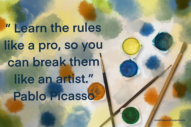
Pablo Picasso Artist Quote

“Learn the rules like a pro, so you can break them like an artist.” – Pablo Picasso

“Have no fear of perfection, you’ll never reach it.” – Salvador Dali

“I am seeking. I am striving. I am in it with all my heart.” – Vincent Van Gogh

“Color! What a deep and mysterious language, the language of dreams.” Paul Gauguin

“In nature, light creates the color. In the picture, color creates the light.” Hans Hofmann

Creativity takes courage.” Henri Matisse

The object of art is not to reproduce reality, but to create a reality of the same intensity.”  Alberto Giacometti 

Art is not what you see, but what you make others see.” Edgar Degas 


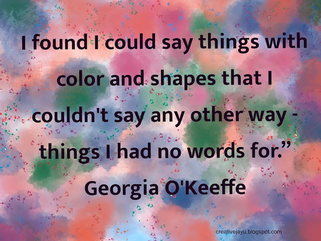
Georgia O'Keeffe Artist Quote


“I found I could say things with color and shapes that I couldn't say any other way - things I had no words for.” Georgia O'Keeffe

Don’t think about making art, just get it done.  Let everyone else decide if it’s good or bad, whether they love it or hate it.  While they are deciding, make even more art.” Andy Warhol 


“Color is the keyboard, the eyes are the harmonies, the soul is the piano with many strings. The artist is the hand that plays, touching one key or another, to cause vibrations in the soul.” Wassily Kandinsky

Nature is not only all that is visible to the eye.. it also includes the inner pictures of the soul.”  Edvard Munch

There's no retirement for an artist, it's your way of living so there's no end to it.” Henry Moore 

One can have no smaller or greater mastery than mastery of oneself.” Leonardo da Vinci 

Creativity is allowing yourself to make mistakes. Art is knowing which ones to keep.” Scott Adams 

If a man devotes himself to art, much evil is avoided that happens otherwise if one is idle.”  Albrecht Durer 

Every artist dips his brush in his own soul, and paints his own nature into his pictures.” Henry Ward Beecher

“The works must be conceived with fire in the soul but executed with clinical coolness.” – Joan Miró

“Every artist was first an amateur.” – Ralph Waldo Emerson

Ansel Adams Art Quote


“You don’t take a photograph, you make it.” – Ansel Adams

“We don’t make mistakes, just happy little accidents.” – Bob Ross

"Without atmosphere a painting is nothing."-- Rembrandt 

I hope you enjoyed this list of famous artist quotes. And I hope that this post has inspired you to pick up your pencils or brush to create your own masterpieces. 

If you have a favorite inspirational art quote, then I would love to know which is your favorite art quote in the comments below. Thanks!

Saturday, February 29, 2020

How The Impressionists Used Complementary Colors To Create an Impact on their artworks

 Complementary colors are basically colors which are on directly opposite sides of the color wheel. So blue is a complement of orange, red is a complement of green, yellow is a complement of purple and so on.


Complementary Color Wheel


Complementary colors provide striking visual effects when paired together. Claude Monet said this about complementary colors in 1888:

"Color makes its impact from contrasts rather than from its inherent qualities....the primary colors seem more brilliant when they are in contrast with their complementary colors."--  Claude Monet

What he meant was that red for example has no meaning or power by itself. But, when paired with a complementary color (being green), you are able to properly see the richness and warmth of that red.

Color is all relative.

The impressionists were masters of color and were very clever in how they used complementary colors to create stunning visual effects. Let us now go through some of the paintings by Claude Monet and Vincent van Gogh which utilizes  complementary colors.

In the painting below of Van Gogh's bedroom, we see a  very intense red of the bedsheet which contrasts against the dull green of the floor. We  also see that the intense orange of the bed frame  contrasts against the weaker blue in  the walls and doors.

Vincent van Gogh, Vincent's Bedroom In Arles, 1889

In the flower painting below, the vibrant red on the wall contrasts against the dull greens of the table and leaves.

Vincent van Gogh, Still Life With Roses And Sunflowers, 1886

In this portrait of Van Gogh he used a simple combination of blues and oranges to create a very striking contrast. His face almost jumps out of the canvas at the viewer. 

Vincent van Gogh, Self Portrait, 1889

In this landscape van Gogh contrasted the vibrant oranges in the foreground against the rich blues in the sky.

Vincent van Gogh, Mulberry Tree, 1889

In this painting by Claude Monet you have a striking contrast between the dull blues and the rich oranges in the sky.

Claude Monet, Grainstacks At Sunset, Snow Effect, 1890-1891

In this painting below  the vibrant reds and yellows contrast against the dark greens and violets.

Claude Monet, Etretat, Cliff Of d'Aval, Sunset, 1885

Finally, in this classic painting by Claude Monet, the sun is contrasted against the dull blue-grays. The orange of the sun is actually not that intense. But, when the rest of the painting is a dull blue-gray, it looks very intense.

Claude Monet, Impression, Sunrise, 1872


I hope you enjoyed reading this article on how Complementary colors used by the Great Masters can add drama to a painting. I hope that this has been inspirational and educational to you. Thank you for reading.

Photo References for Van Gogh and Claude Monet paintings taken from -https://www.wikiart.org

I am sure that there are other great artists who create an impact with their art by using a complementary color scheme. Let me know in the comments below which  other artists you think creates an impact by using a complementary color scheme. I would love to hear from you! Thanks!


Monday, January 20, 2020

Basics-- Composition

 Composition involves working with spatial concepts to create a pleasing layout. Some rules are classically simple. The first thing you need to decide is if you want to use a vertical (portrait) or a horizontal (landscape) format. Sometimes that decision can be simple but not always.  Consider the fact that horizontal compositions tend to be restful, and vertical compositions are more energizing. So if you are making a sketch of cattle lying in a field in a vertical format you might want to reconsider your decision. Also where you place your center of interest will determine its importance. Experiment with different arrangements and formats until you are pleased with the visual weight of your center of interest. 

CENTER OF INTEREST: The center of interest is the most important visual element of a picture. In most realistic works of art, the center of interest is the subject of the painting. 

Divide the Composition into Thirds

Divide your working area into thirds, top to bottom and from side to side as shown in the picture below. The center of interest will be most pleasing, in a traditional manner, if you place it at one of the intersections of those lines. This works well, whether you choose a horizontal or a vertical format. 

Rule of Thirds

Infographic  below shows eye-tracking  studies  to show  where will the viewer look first  when looking at a picture/painting/photographs. This  will aid in designing your own compositions in the future. 


Eye- Tracking Focal point Studies

Off Balance

It is not always necessary or even desirable to stick with the classical mode of composition, of course. Explore an off-balance, unusual composition by placing your subject off to one side for a lively sense of motion--  like  the picture below.

Off Balanced Composition


 *** Quick Tip ***

USE VARIETY-- Don't make everything the same size or spaced the same distance apart in your composition. That can be boring and static. By using variety in sizes or spacing can add visual interest to the composition. 

 So, do you have a Composition tip or hack that you would like to share? Let me know in the comments below.